News

‘Draw Like a Machine: Pop Art, 1952 – 1975’ at the Menil Drawing Institute, Houston Reviewed by Melissa L. Mednicov for Glasstire
Draw Like a Machine: Pop Art, 1952 – 1975, curated by Kelly Montana, is currently on view at the Menil Drawing Institute. The exhibition, within two galleries, seeks to redefine aspects of Pop art: the movement’s parameters, its key artists, and their use of drawing. The exhibition features the canonical Pop (art) stars Andy Warhol, James Rosenquist, Ed Ruscha, and Roy Lichtenstein, as well as some recently recuperated Pop artists, such as Chryssa, Marjorie Strider, and Idelle Weber. Some artists who float in and out of the “Pop” designation are included: Jasper Johns, Claes Oldenburg, Robert Rauschenberg, Jim Dine, Leon Polk Smith, Al Hansen, and Lee Lozano; at times, these artists test the limits of Pop in the exhibition.
Entering the gallery space, Pop “stars” greet you on either side: Warhol to your right, Rosenquist to your left. Warhol’s drawing Gold Rose (1957) — a delicate blooming gold rose with leaves like lips in a vase against a pink background — creates a strong contrast against a somber Rosenquist drawing (Untitled, 1975) which, in grey tones, features an American flag triangulated along with Mobil Oil’s Pegasus logo and a part of a rocking chair. In the center of Rosenquist’s drawing, graphite expands like a swell from a hole similar to a violent shot, or a rupture, through the paper. Warhol and Rosenquist help to introduce some of the subjects of Pop in the two galleries: love (or lust), consumer products, and commodity exchange within the auspices of American life.
Continuing into the first room, Warhol’s detailed and lingering portraits of art critic Gene Swenson’s face and profile, six drawings in total, use line to give heightened attention to the critic’s features. Warhol’s suite of drawings, alongside his Male Profile with Marbleized Background (1962), show a sparing use of line, which allows the blank reserve of paper to occupy the majority of his composition. A similar use of paper occurs on the same wall, with Roy Lichtenstein’s Foot Medication (1962). There is a play between Lichtenstein’s act of drawing and the woman’s hand: her hand applies the medication; his hand applies graphite. Yet little to none of his mark making transpires on her hand: a soft and lush graphite background emphasizes the empty space of the woman’s foot, hand, and cotton ball.
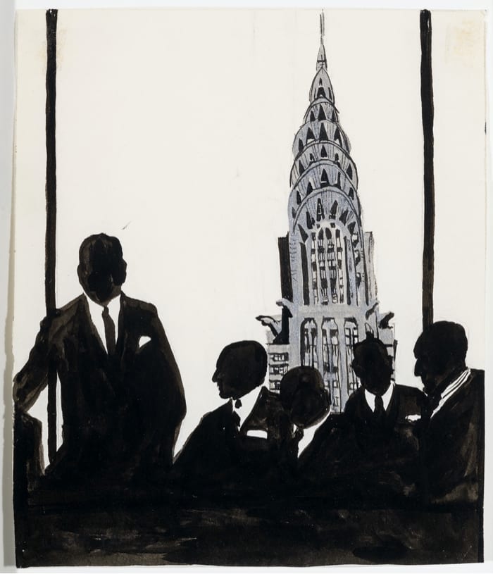
The exhibition’s second room is anchored by a Pepto pink wall. The color fizzes against Marjorie Strider’s Party (1973), a soda can bursting with pink “bubbles” (appearing more ooze-like than anything else). Strider, belatedly recuperated into Pop, toys with expectations — the can is clearly labelled as Coca Cola, yet the artist’s gesture and acumen are clear; the graphite rendering the aluminum can is applied flawlessly, to an almost shine-like effect. The pink is funky with its unknown ooze, a way to mess with viewers’ expectations. The pink wall fizzes, too, with the pleasures of Warhol’s Ice Cream Dessert (1959). A small drawing by Idelle Weber, Uptown Men (1962), features silhouetted businessmen with a view of the Chrysler Building in glorious abbreviated detail. Another work by Weber, Untitled (1962), depicts a similar suited businessman type in black who is completely covered in mini, rubber stamp-applied lipstick kisses. Both works, with their intimate scales and sharp details, force the viewer to move in and get close.
Lichtenstein’s Steak (1963), while maybe appearing like food one might eat with a soda and ice cream, disrupts the saccharine ease of the pink wall. Lichtenstein’s drawn Ben Day dots (using the tools of mechanical reproduction via hand application) detach and disassociate the steak from its diner counterpart in a way similar to how Strider’s pink ooze inextricably separates her can from the Coke you can buy. Both the Pop artists and the Menil Drawing Institute’s installation use pink to seduce the viewer and bring them closer. The drawings, then, expand beyond traditional drawing media and beyond any preconceived, easily digestible notions of the Pop art movement.
Elsewhere in the exhibition, some sweet Pop moments are tempered by Jim Dine’s Untitled (Tool Series) from 1973, a graphite drawing featuring an ethereal hammer that’s poised and ready to hit (the hammer head is the most defined aspect of the work, the potential for impact made legible). Also dissipating the viewer’s bubblegum Pop expectations are Lee Lozano’s drawings of aggressive machine-like objects; somber breaking points (possible disintegrations) of Pop in the exhibition include Rosenquist’s Untitled and Claes Oldenburg’s Studies for Store Objects – Petticoat, Flag, Gun (1961) where, typical of Oldenburg’s objects from The Store, commodities are rendered grotesque.
Lee Lozano’s mechanical “portraits,” so small and so brutal, create fissure near the glowing and gloaming black orb of Ed Ruscha’s pastel Ball (1973-1974), which sits against a lime green field. Placed near each other, the hard points of Lozano’s pieces test the color exercise of Rucha’s luminous drawing. Other moments in the gallery space include Sturtevant’s Flag after Jasper Johns (1967) (which provides a nice parallel to Johns’ Two Flags (1969) in the first room) and Al Hansen’s Apotheosis of Hershey Wrapper – Three Thugs Attacked Him in the Men’s Room of ‘Il Mio’ (1964).
Hansen’s collage uses Hershey candy bar wrappers, whose logo and letters proliferate in a series of words: primarily “HEY,” but also “YES,” “NO,” “HER,” and “OH.” Every so often the copyright printed on the wrappers reminds the viewer of the materials’ origins (although it seems unlikely one might lose track). “Hershey’s,” synonymous with milk chocolate and the company, is broken across the work. The apostrophes in the word operate mostly as commas due to their placements in the piece — as a stopping point within an abundance of language. A similar maneuver occurs in some places with the registered trademark symbol and its placement to the bottom right of the “Y.” The language of candy — the language of commodity — becomes dizzyingly empty with its maximum proliferation of language, amounting in little or no cogency.
The drawings featured, like the show’s curation, are exquisite and precise, and ask the viewer to reconsider how they understand Pop and its contemporary applications. The exhibition includes at least four works that reference the American flag, situating the show within a mostly American Pop. The movement’s subjects, often described in terms of ambiguity and commodity exchange, are represented here with Hershey wrappers, portraits of the stock market, a sweet ice cream sundae, and more.
Other moments, too, exist within our familiar Pop iconography: a portrait of a maybe lover, sounds evoked by a record (in Johns’ Scott Fagan Record), the fizz of a soda can, and the buzz of a kiss — all the people, and the things, that make up a life. Many of the works come across as soft and lush, yet every so often a hammer appears. The drawings challenge the engrained notions of Pop, grounding the viewer in the exhibition’s materiality — both of its subject and medium.
Draw Like a Machine: Pop Art, 1952 – 1975, curated by Kelly Montana, Assistant Curator, is on view at the Menil Drawing Institute from October 29, 2021-March 13, 2022.


